
Old English Font Generator: Blackletter Text to Copy and Paste
This Old English font generator turns typed text into Unicode fraktur characters, the blackletter look of early printing, that you can paste into names, bios and gaming tags. Type below and copy regular (𝔒𝔩𝔡 𝔈𝔫𝔤𝔩𝔦𝔰𝔥) or bold (𝕺𝖑𝖉 𝕰𝖓𝖌𝖑𝖎𝖘𝖍) fraktur. Numbers stay plain, because Unicode has no fraktur digits.
Old English font generator
No fraktur digits
No digits
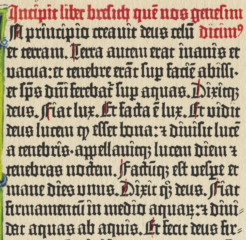
When Johannes Gutenberg printed his Bible around 1455, he set it in a blackletter type modeled on the dense, angular handwriting of scribes. That look, heavy vertical strokes, sharp angles and tight spacing, is what most people now mean by an Old English font, and it is what this Old English font generator recreates with Unicode characters.
The name is a little misleading. The Old English language was spoken centuries before printing existed, and blackletter came in many regional forms. Unicode calls its version fraktur, after one of those forms, and encodes it in the Mathematical Alphanumeric Symbols block for use in mathematics. Generators borrow those letters so you can paste a blackletter look anywhere that accepts text.
Blackletter, fraktur, Old English: three names for one look
Blackletter is the family name for the broad-nib scripts and typefaces of medieval and early modern Europe. The pages are dark because the strokes are thick and the gaps between them are narrow, which is where the name comes from.
Fraktur is one member of that family, with broken, angular curves. It stayed in common use in German-language printing long after most of Europe switched to roman type, well into the 20th century. That long life is part of why fraktur is the form most people recognize today.
Old English is the popular label, and it is the one people search for. It refers to the look, not the language. When a font site, a tattoo artist or a sign maker says Old English, they nearly always mean a blackletter design, and the Unicode fraktur letters our generator outputs belong to the same visual family.
The practical consequence is that you should not expect a match with any particular blackletter typeface you have seen on a poster or a tattoo. The Unicode characters are drawn by whatever font the reader's device uses for that block, so the exact shapes vary from system to system. The family resemblance holds; the details do not.
From the printing press to the Unicode chart
Blackletter never fully disappeared. It survives in places that want to look old, formal or traditional, such as newspaper nameplates and certificates, and in plenty of logos that borrow that weight. That is the mood people are after when they paste fraktur into a profile.
Unicode's reason for encoding fraktur letters is entirely different. Mathematicians use fraktur as a separate set of symbols, so a fraktur g and a plain g can stand for different objects in the same formula. The Unicode Standard places these letters in the Mathematical Alphanumeric Symbols block (U+1D400–1D7FF) for exactly that purpose; styling a username was never the intent.
That origin explains the two quirks of fraktur text. The alphabet has no digits, because mathematical notation did not need fraktur numerals. And five capitals live in a different block, because they had already been encoded as symbols before the full alphabet was added.
The five capitals from Letterlike Symbols
Before the math alphabets existed, Unicode's Letterlike Symbols block (U+2100–214F) already contained five black-letter capitals: ℭ (U+212D), ℌ (U+210C), ℑ (U+2111), ℜ (U+211C) and ℨ (U+2128). When the fraktur alphabet arrived, Unicode reserved the matching slots in the math block and pointed to those older characters instead.
The table shows the five. A generator that computes every letter by offset outputs the reserved code points, and on 2026-10-27 we confirmed that no system font on macOS 26.5.1 or Android draws any of them. They appear as boxes for everyone. Our engine substitutes the Letterlike characters, so "Christmas Hall" comes out as ℭ𝔥𝔯𝔦𝔰𝔱𝔪𝔞𝔰 ℌ𝔞𝔩𝔩 and "Richard Zane" as ℜ𝔦𝔠𝔥𝔞𝔯𝔡 ℨ𝔞𝔫𝔢.
Because those five capitals come from a different block, some systems draw them with a different font from the lowercase letters around them, and they can look slightly heavier, lighter or taller. That is expected. Bold fraktur has no borrowed letters at all; its 52 letters form one complete run.
Ordinary words show how often the five appear. Any name or word starting with C, H, I, R or Z, which covers Christmas, Halloween, Irish, Royal and Zone, begins with a Letterlike capital in regular fraktur. That is normal and correct; only a generator that ignores the substitution gets those words wrong.
| Letter | Empty slot a naive generator uses | Drawn there? | Correct character |
|---|---|---|---|
| C | U+1D506 (reserved, unassigned) | No — box on macOS and Android | ℭ U+212D |
| H | U+1D50B (reserved, unassigned) | No — box on macOS and Android | ℌ U+210C |
| I | U+1D50C (reserved, unassigned) | No — box on macOS and Android | ℑ U+2111 |
| R | U+1D515 (reserved, unassigned) | No — box on macOS and Android | ℜ U+211C |
| Z | U+1D51D (reserved, unassigned) | No — box on macOS and Android | ℨ U+2128 |
All 62 characters, mapped
The grid shows every plain letter and digit beside its fraktur form. The five highlighted capitals are the Letterlike substitutions. The ten dashed cells are digits, which stay plain because fraktur has none in Unicode.
Some fraktur letters are hard to recognize if you have not read blackletter before. Capital 𝔄, 𝔘 and 𝔑 look alike at a glance, lowercase 𝔣 and 𝔰 are easy to mix up, and 𝔨 looks little like a modern k. Check the grid when you are unsure what a pasted letter is, and test your text on someone who has not seen it typed in plain letters first.
Writing in all capitals makes this worse. Blackletter capitals are ornate and were designed to start a word, not to sit side by side, so 𝔒𝔏𝔇 𝔈𝔑𝔊𝔏ℑ𝔖ℌ is far harder to read than 𝔒𝔩𝔡 𝔈𝔫𝔤𝔩𝔦𝔰𝔥. Capitalize the first letter of each word and keep the rest lowercase.
Regular or bold fraktur?
Both are drawn from the Mathematical Alphanumeric Symbols block, and both cover 52 letters with no digits. We measured each against every system font on macOS 26.5.1 (365 font files) and on Android: all 52 letters of both styles are drawable on both systems. We did not measure Windows.
Regular fraktur, 𝔒𝔩𝔡 𝔈𝔫𝔤𝔩𝔦𝔰𝔥 𝔗𝔢𝔵𝔱, is lighter and closer to a printed page. Bold fraktur, 𝕺𝖑𝖉 𝕰𝖓𝖌𝖑𝖎𝖘𝖍 𝕿𝖊𝖝𝖙, is heavier and reads better at small sizes, which matters in a name list or a game lobby. Bold fraktur also avoids the mismatched-capital effect, since it has no borrowed letters.
A useful rule: use regular fraktur for a short line someone will look at closely, such as a profile header, and bold fraktur wherever the text will be small or read quickly.
To paste either style, type in the box at the top of the page, press the copy button beside the weight you want, then paste into the target field: long-press and choose Paste on a phone, or Ctrl+V (⌘V on a Mac) on a computer. Look at the app's preview before you save, since that preview is drawn with the same kind of system fonts your readers have.
If you need to type fraktur often, for example in technical writing, a generator is still the quickest route on any system: type the plain word, copy the converted version, paste it where you need it. The characters are the same ones a math input method would give you, so the result is identical.
Dates and numbers in a blackletter line
"Est. 1455" becomes 𝔈𝔰𝔱. 1455 in regular fraktur and 𝕰𝖘𝖙. 1455 in bold. The year stays in ordinary digits because Unicode encodes no fraktur numerals, and no generator can add them.
Plain digits next to blackletter rarely look wrong, because the eye reads them as a separate kind of symbol anyway. If you want the whole line to feel uniform, spell short numbers out, or, for a gaming tag, consider leaving the number out entirely. Mixing in another decorative digit style, such as double-struck 𝟙𝟜𝟝𝟝, usually looks busier rather than more consistent.
Roman numerals are another option that suits the period feel. Typed as ordinary capital letters, "MMXXVI" converts fully into fraktur capitals, though at that point readability drops sharply, so keep it for decoration rather than information.
Gaming names and tags: what to expect
A lot of fraktur goes into game names, clan tags and name tags. Whether it sticks depends on the game's name filter, and most games do not publish what they allow. Roblox, for example, says all text is filtered and that blocked text appears as ####, but it does not publish a list of permitted characters, so no one can promise fraktur will pass.
Platforms that do publish rules tend to separate the name people type from the name people see. Discord's help center limits usernames to a–z, 0–9, underscore and period, while saying display names may include special characters. Expect the same split elsewhere: style the display name, keep the login name plain.
If a game rejects the name, it is the filter, not the generator. Every Old English generator outputs the same Unicode characters, so trying another tool will not help. Try a shorter styled part, or style only the capital letters.
A good pattern for a clan or team tag is a short fraktur prefix and a plain player name, such as 𝕶𝖓𝖎𝖌𝖍𝖙𝖘 followed by your usual handle. The tag gives the look, and teammates can still find and type the name they know.
Keep blackletter short
Blackletter was made for a slow reader holding a book, not for a glance at a phone. A name or two words in fraktur has character; a full sentence is a puzzle. Use it for the part you want noticed and write the rest plainly.
There is an accessibility side as well. Each fraktur letter has a formal name, such as MATHEMATICAL FRAKTUR CAPITAL O, and screen readers vary in whether they announce that name, read the plain letter or skip it. The W3C's guidance asks that information not depend on visual presentation alone, so keep anything essential, like a contact handle, in plain text.
Search is the last consideration. Fraktur letters are different characters from plain ones, although each has a compatibility mapping back to its plain letter. Software that normalizes text will match 𝔒𝔩𝔡 𝔈𝔫𝔤𝔩𝔦𝔰𝔥 to Old English; software that compares characters directly will not. If people need to find you by name, keep a plain version of it visible.
Questions people ask
- Is this a real Old English font I can install?
- No. The output is Unicode fraktur characters, not a font file. It pastes into apps with no font menu because the characters themselves carry the look. Readers see it drawn in their own device's fonts, so the exact shapes vary a little between systems.
- Why do C, H, I, R and Z look a bit different?
- Those five fraktur capitals come from the Letterlike Symbols block, because they were encoded there first. Some systems draw them with a different font from the letters around them.
- Why don't my numbers change?
- Unicode has no fraktur digits in either weight, so numbers stay plain. Spell them out if you want the whole line in blackletter.
- Will Old English text work in my game name?
- It depends on the game's filter, and most games do not publish their allowed characters. Roblox, for example, filters all text but lists no permitted characters.
- Is fraktur the same as Gothic text?
- People often use gothic and Old English for the same blackletter look. Unicode's name for its version is fraktur. Whatever the label, the characters our generator outputs are the same fraktur letters every Old English tool uses.
Sources & further reading
Read next
- Cursive Font Generator
Cursive font generator with thin and bold Unicode script. See the 11 letters borrowed from an older block, why numbers stay plain, and measured coverage.
- Bold Text Generator
Bold text generator with six Unicode bold styles, serif to fraktur. See which ones have bold digits, every character mapped, and measured phone coverage.
- Copy and Paste Fonts
Copy and paste fonts in 27 Unicode styles: bold, cursive, Old English and more. See which letters each style lacks and which phones can draw them.
- Glitch Text Generator
Glitch text generator for zalgo, cursed and creepy text. See how combining marks stack above, through and below letters, why they spill, and how to strip them.
Part of Copy and Paste Fonts. Want every style at once? Use the fancy text generator on the home page.

Sukie · Editor
Sukie edits Fancy Text Styles. Every style on the site is checked against the Unicode Consortium code charts before it is published, and every page names the characters a style cannot produce instead of hiding them.
About this site · How pages are checked · Last updated October 27, 2026
Fancy Text Styles is an independent site. Discord, Instagram, TikTok, X and other platform names belong to their owners and are used only to describe where text is pasted; none of them endorse this site.