
Italic Font Generator (With the Letter h That Actually Shows Up)
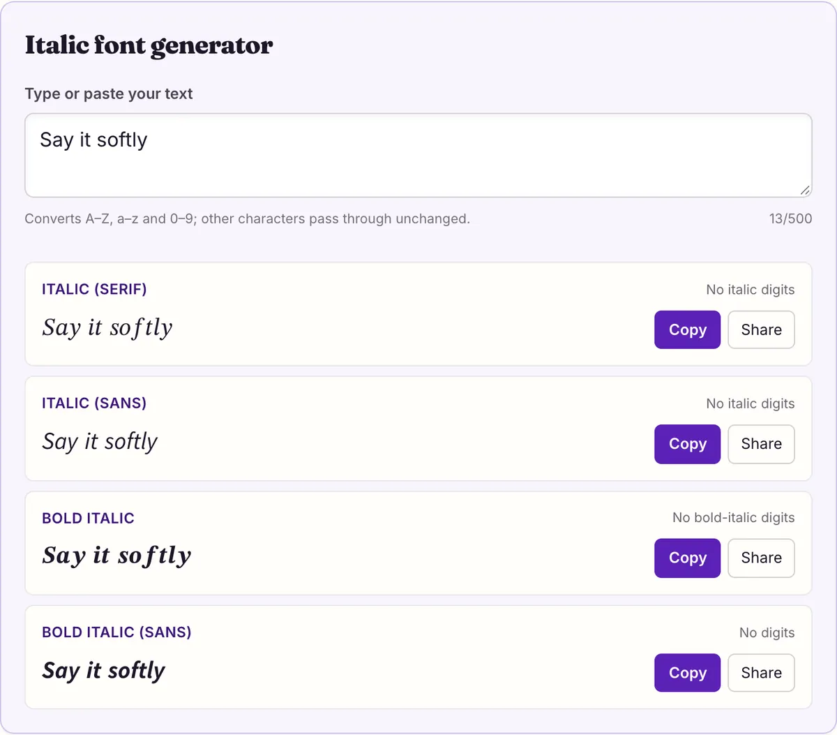
This italic font generator converts your text into Unicode italic letters you can paste where no italics button exists. Type below and copy one of four styles: italic serif (𝑆𝑎𝑦 𝑖𝑡), italic sans (𝘚𝘢𝘺 𝘪𝘵), bold italic or bold italic sans. Unicode has no italic digits, so numbers stay plain, and the serif italic h comes from a separate character, ℎ.
Italic font generator
No italic digits
No italic digits
No bold-italic digits
No digits
Here is a plain observation about every italic font generator, including this one: one letter does not come from where you would expect. The serif italic alphabet sits in a single run of the Mathematical Alphanumeric Symbols block, except for lowercase h. Its slot, U+1D455, is reserved and empty. The real italic h is ℎ, U+210E, in the Letterlike Symbols block, and its official name is PLANCK CONSTANT.
A tool that computes letters by offset alone outputs the empty slot, and readers see 𝑤□𝑖𝑐□ instead of 𝑤ℎ𝑖𝑐ℎ. We checked the reserved code point against every system font on macOS 26.5.1 and Android on 2026-10-27, and no font draws it. Our engine always substitutes ℎ.
Why the italic h lives at U+210E
Unicode did not design its math alphabets in one sitting. A small set of styled letters was already encoded in the Letterlike Symbols block (U+2100–214F) because they were in use as symbols in their own right. The italic h used for Planck's constant was one of them, so U+210E existed before the Mathematical Alphanumeric Symbols block was added.
When the full italic alphabet arrived, Unicode did not encode the italic h a second time. It left the slot where h would naturally fall, U+1D455, permanently reserved and pointed to ℎ instead. The Unicode chart marks that position as reserved with a note directing readers to the Letterlike character. The result is an alphabet that is complete in practice but not contiguous in code points.
The table below shows that single hole. It is the only one in any of the four italic styles: italic sans, bold italic and bold italic sans each have their own full run with an encoded h, so a generator can calculate those safely. Only the serif italic needs the substitution.
You can see the substitution at work in an ordinary sentence. "The Hobbit, chapter 3" becomes 𝑇ℎ𝑒 𝐻𝑜𝑏𝑏𝑖𝑡, 𝑐ℎ𝑎𝑝𝑡𝑒𝑟 3. Both lowercase h's are U+210E; the capital H is the normal math italic 𝐻, because only the lowercase letter was encoded early. Notice also that the 3 stays plain, which brings us to the second gap.
Fraktur, script and double-struck have the same kind of gap on a larger scale: 5, 11 and 7 letters respectively come from Letterlike Symbols. Across all the alphabets our generator makes, there are 24 such holes, and the italic h is the only one in an italic style. The same measurement that found no font drawing U+1D455 found no font drawing any of the other 23 reserved slots either.
| Letter | Empty slot a naive generator uses | Drawn there? | Correct character |
|---|---|---|---|
| h | U+1D455 (reserved, unassigned) | No — box on macOS and Android | ℎ U+210E |
Fifty-two letters and no digits
The grid shows every plain letter and digit beside its italic serif form. The highlighted cell is ℎ. The ten dashed cells are the digits, and they are dashed because Unicode simply has no italic digits. That is not a limitation of this tool; the Mathematical Alphanumeric Symbols block encodes digits only in bold, double-struck, sans-serif, sans-serif bold and monospace.
In practice, mixing italic letters with plain digits rarely looks wrong, because italic and upright numerals are close in shape and most text uses few of them. Where it does look off, in a year or a score set on its own, you have two honest choices. Leave the number plain, or rewrite it as words: "chapter three" converts fully, "chapter 3" does not.
Here is the difference side by side. "Chapter 3" in serif italic gives 𝐶ℎ𝑎𝑝𝑡𝑒𝑟 3, with an upright 3 at the end. "Chapter three" gives 𝐶ℎ𝑎𝑝𝑡𝑒𝑟 𝑡ℎ𝑟𝑒𝑒, every character slanted. Spelling out small numbers is common in everyday writing anyway, so the workaround rarely looks forced.
Punctuation behaves the same way. Commas, periods, question marks, apostrophes and quotation marks have no math italic forms and pass through unchanged. Accented letters do too: é, ü and ñ stay upright, because the math alphabets cover only the 26 basic Latin letters in each case. If your text is in French, German or Spanish, expect some upright letters in the middle of italic words.
We measured coverage for all four italic styles on 2026-10-27. On macOS 26.5.1 (365 system font files) and on the Android system fonts, all 52 letters of each style are drawn by at least one font. We did not measure Windows, so we make no claim about it.
Serif, sans, bold: which italic reads best?
The four styles share the same 52 letters and the same missing digits. What differs is weight and shape, and those decide whether the text looks like a quiet aside or a shout. Here is "which highway", a phrase with three h's, in each one.
Italic serif is the lightest of the four and the most bookish; it suits a quote, a title or a soft aside. Its one quirk is that ℎ may be drawn by a different font from its neighbors on some systems, which can make the h look a touch wider or taller. Italic sans is cleaner and reads well at small sizes, which makes it a good default for comments and short bios.
The two bold italics are for emphasis rather than tone. Bold italic serif (𝑺𝒂𝒚 𝒊𝒕 𝒔𝒐𝒇𝒕𝒍𝒚) is heavy and formal; bold italic sans (𝙎𝙖𝙮 𝙞𝙩 𝙨𝙤𝙛𝙩𝙡𝙮) looks sporty and loud. Use either for one word or a short phrase. A full sentence in bold italic is harder to read than either bold or italic alone, and it leaves nothing for the emphasis to stand out against.
Whichever you choose, keep one style per line. Mixing serif and sans italic in the same sentence is the fastest way to make pasted text look accidental, because the two alphabets have different letter widths and stroke contrast.
| Style | Sample | Where its h comes from |
|---|---|---|
| Italic (serif) | 𝑤ℎ𝑖𝑐ℎ ℎ𝑖𝑔ℎ𝑤𝑎𝑦 | Letterlike Symbols, U+210E |
| Italic (sans) | 𝘸𝘩𝘪𝘤𝘩 𝘩𝘪𝘨𝘩𝘸𝘢𝘺 | Math block, own run |
| Bold italic | 𝒘𝒉𝒊𝒄𝒉 𝒉𝒊𝒈𝒉𝒘𝒂𝒚 | Math block, own run |
| Bold italic (sans) | 𝙬𝙝𝙞𝙘𝙝 𝙝𝙞𝙜𝙝𝙬𝙖𝙮 | Math block, own run |
Use real italics when the app has them
Unicode italics are a workaround, and the best workaround is often not needing one. Many chat apps have true italics built in. Discord's help center, for example, documents *italics* or _italics_ with single asterisks or underscores, and ***bold italics*** with three. That markup produces genuinely formatted text that search, copy and screen readers all treat as normal letters.
The classic case for Unicode italics is a book, film or album title on a platform with no formatting, a question people ask often. Typing 𝑇ℎ𝑒 𝐻𝑜𝑏𝑏𝑖𝑡 gets the convention right visually. The trade-off is that the title becomes a string of mathematical characters. A screen reader may announce each one by its formal name, read the base letters, or skip them, depending on the reader. Someone searching that platform for "hobbit" may or may not find your post, depending on whether the platform normalizes text.
Emphasis inside a sentence is the other common use. A single italic word, "I 𝘴𝘢𝘪𝘥 Tuesday", reads naturally and costs very little in accessibility, because only one word is affected. The cost grows with every styled word, so the shorter the italic stretch, the better the trade.
The W3C's accessibility guidance makes the underlying point: meaning should not depend on visual presentation alone. For a title, the fix is easy. Quotation marks or plain capitals carry the same information without any of the risk, and you can still italicize the title for readers who see it if the platform's audience is mostly sighted and the post is casual.
In documents, always use the editor's italic command rather than pasting these characters. Pasted math italics are not recognized by spellcheckers, do not respond when you change the paragraph's font, and can confuse anyone who later copies the text into another tool.
Getting italic text into a bio, comment or name
The mechanics are the same wherever you paste. Type your text in the generator, copy the style you want with its copy button, switch to the app, place the cursor in the field and paste. On a phone that means long-pressing the field and choosing Paste; on a computer, Ctrl+V or ⌘V.
Profile bios and display names are where italics are asked about most, and they are a reasonable fit: short, read by people rather than searched, and rarely typed by anyone else. Comments are similar, though a whole italic comment can be tiring to read. Usernames and handles are the poor fit, because those fields often accept only plain letters, numbers and a little punctuation. Discord, for instance, limits usernames to a–z, 0–9, underscore and period, while saying display names may include special characters.
When a pasted italic line does not look right, the symptom tells you the cause. A box in place of every h means the text came from a generator that used the reserved slot, so regenerate it here. Plain numbers mean the style has no digits, which no tool can change. Upright accented letters mean those letters have no italic form. Letters that look upright on someone else's phone but slanted on yours point to their device's fonts.
Before you save a bio, paste the text into a draft or private note and look at it on a second device if you can. The characters are identical everywhere; only the fonts that draw them change, so that one check tells you most of what your readers will see on that kind of device.
One more failure is worth knowing about: some apps quietly convert pasted text back to plain letters when they save it, because the math italic letters have compatibility mappings to ordinary ones. If your italics vanish after saving even though the preview showed them, that is what happened, and no generator can work around it.
Questions people ask
- Why are my numbers not italic?
- Unicode has no italic digits in any of the four italic styles. Only bold, double-struck, sans-serif, sans-serif bold and monospace have digits. Write numbers as words if you want them fully italic. Punctuation and accented letters also stay upright, because they have no math italic forms.
- Why does the h look slightly different from the other letters?
- In serif italic, h is U+210E from the Letterlike Symbols block, because its slot in the math block is reserved. Some fonts draw it a little differently from the letters around it.
- Can I make my Instagram name or bio italic?
- There is no documented italic setting for bios, so pasted Unicode italics are the way people do it. We have not tested Instagram directly; check the result in a draft before you save. If the bio field accepts the text and your preview shows it slanted, readers on systems with the right fonts will see the same characters.
- Is italic the same as cursive?
- No. Italic is slanted print; cursive (Unicode script) imitates joined handwriting, like 𝓈𝒸𝓇𝒾𝓅𝓉. Both lack digits, and script has 11 letters borrowed from Letterlike Symbols instead of one.
Sources & further reading
Read next
- Bold Text Generator
Bold text generator with six Unicode bold styles, serif to fraktur. See which ones have bold digits, every character mapped, and measured phone coverage.
- Cursive Font Generator
Cursive font generator with thin and bold Unicode script. See the 11 letters borrowed from an older block, why numbers stay plain, and measured coverage.
- Small Text Generator
Small text generator for small caps, superscript and subscript, with the exact letters each one is missing and how they display on macOS and Android.
- Copy and Paste Fonts
Copy and paste fonts in 27 Unicode styles: bold, cursive, Old English and more. See which letters each style lacks and which phones can draw them.
Part of Copy and Paste Fonts. Want every style at once? Use the fancy text generator on the home page.

Sukie · Editor
Sukie edits Fancy Text Styles. Every style on the site is checked against the Unicode Consortium code charts before it is published, and every page names the characters a style cannot produce instead of hiding them.
About this site · How pages are checked · Last updated October 27, 2026
Fancy Text Styles is an independent site. Discord, Instagram, TikTok, X and other platform names belong to their owners and are used only to describe where text is pasted; none of them endorse this site.